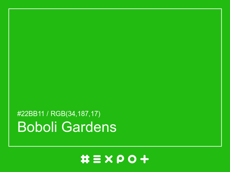
Boboli Gardens is vivid, warm-toned shade of warm green. It is better contrasting with white. This color combines beautifully with cool magenta, warm red or cool blue
| Inverse Color | #d4e |
| Complementary Color | #a910bb |
| Color Shade: | warm green (114° hue) |
| Color Temperature: | warm |
| Lightness: | 40% (better contrasting with white) |
If you're looking for a similar warm green shade, there are some better alternatives to Boboli Gardens Color. The Felwood Leaves color for instance is a lighter and a bit more faded option, however this color has a yellow green bias. Consider a darker and more soft alternative called Pikkoro Green (#15b01a) for more calm effect. Try Monstrous Green as it also a bit more vibrant and energetic.
#a910bb is the best complementary color to Boboli Gardens. Cool magenta shades generally complement the warm green hues best as they are found on the opposite end of the color wheel. The most popular #2b1 complementary color is Seance, as it offers maximum contrast and grab the viewer's attention.
The analogous palette of cool yellow, warm green, and cool green colors offers a soft combination of similar warm shades. The analogous colors of White are #76bb10 and #10bb55. Thus found on the left and right of #2b1 on the color wheel with a 30° gap. Consider matching Lima and Malachite colors as they work well with Boboli Gardens.
The split-complementary Boboli Gardens palette consists of #bb1076 and #5410bb colors. They can be found 30° apart on either side of the complementary color (#a910bb). Try Red Violet and Blue Gem colors in combination with #2b1, as they are not as contrasting as a complementary color, hence, giving more hue variety to make your design stand out.
The triadic palette of #2b1 offers a combination of cool red and cool blue shades and equally high contrast between the three of them. Find triadic colors at the 120° distance from the Boboli Gardens. Thus Shiraz and Torea Bay giving maximum hue separation to use all three together.
The square color palette of Boboli Gardens contains three additional colors. Thus, complementary Seance, Denim, and Fiery Orange split by 90° on the color wheel. #2b1 square combo is a palette of warm green, cool cyan, cool magenta and warm red shades that work together well.
The tetradic palette is a bit more complex than the square and has more of a rectangle shape. Boboli Gardens tetradic combo consists of cool magenta complementary color (#a910bb) and two others. The Torea Bay is positioned 120° clockwise from the primary color and Sahara – 120° from the complementary Seance. This palette is not recommended to use as-is. Try to tweak the saturation and brightness of #1021bb and #bbaa10.
In a RGB color space, hex #22bb11 is made of 14% red, 79% green and 7% blue. In a HSL mode Boboli Gardens has a hue angle of 114°, a saturation of 83.33% and a lightness of 40%. In a CMYK space (used in printing only), hex #22bb11 is made of 60% cyan, 0% magenta, 66.66% yellow and 26.67% black ink.
| HEX | #22bb11 |
| RGB Decimal | rgb(34,187,17) |
| RGB Percentage | 14%, 79%, 7% |
| CMYK | 60, 0, 66.66, 26.67 |
| HSL | hsl(114,83.33%,40%) |
| HSV (or HSB) | hsv(114,90.91%,73.33%) |
| CIE-LAB | lab(66.4597,-65.5006,64.0582) |
| XYZ | xyz(18.5312,35.9212,6.4871) |