Tint of Turquoise Color

#41bfb5

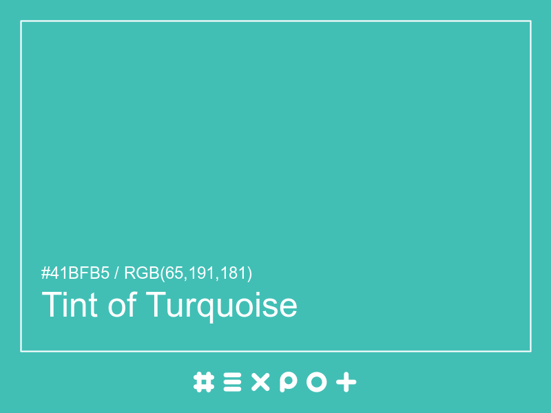
Tint of Turquoise is calm, cool-toned shade of warm cyan. It is better contrasting with white. This color combines beautifully with cool red, cool yellow or cool magenta

Inverse Color #be404a
Complementary Color #bf414a
Color Shade: warm cyan (175.24° hue)
Color Temperature: cool
Lightness: 50.2% (better contrasting with white)
Tint of Turquoise Color Sample

Better Alternatives To #41bfb5

If you're looking for a similar warm cyan shade, there are some better alternatives to Tint of Turquoise Color. The Blue Radiance color for instance is a lighter and a bit more vibrant option, however this color has a green cyan bias. Consider a darker and more soft alternative called Baltic Green (#3aa098) for more calm effect. Try Zomp as it also a bit more faded and calm.

Complementary Palette

#bf414a is the best complementary color to Tint of Turquoise. Cool red shades generally complement the warm cyan hues best as they are found on the opposite end of the color wheel. The most popular #41bfb5 complementary color is Crail, as it offers maximum contrast and grab the viewer's attention.

Analogous Palette

The analogous palette of cool green, warm cyan, and cool cyan colors offers a soft combination of similar cool shades. The analogous colors of Puerto Rico are #41bf76 and #4189bf. Thus found on the left and right of #41bfb5 on the color wheel with a 30° gap. Consider matching Emerald and Boston Blue colors as they work well with Tint of Turquoise.

Split-complementary Palette

The split-complementary Tint of Turquoise palette consists of #bf7641 and #bf4189 colors. They can be found 30° apart on either side of the complementary color (#bf414a). Try Copper and Mulberry colors in combination with #41bfb5, as they are not as contrasting as a complementary color, hence, giving more hue variety to make your design stand out.

Triadic Palette

The triadic palette of #41bfb5 offers a combination of warm yellow and cool magenta shades and equally high contrast between the three of them. Find triadic colors at the 120° distance from the Tint of Turquoise. Thus Roti and Amethyst giving maximum hue separation to use all three together.

Square Palette

The square color palette of Tint of Turquoise contains three additional colors. Thus, complementary Crail, Fuchsia Blue, and Sushi split by 90° on the color wheel. #41bfb5 square combo is a palette of warm cyan, warm blue, cool red and cool yellow shades that work together well.

Tetradic Palette

The tetradic palette is a bit more complex than the square and has more of a rectangle shape. Tint of Turquoise tetradic combo consists of cool red complementary color (#bf414a) and two others. The Amethyst is positioned 120° clockwise from the primary color and Apple – 120° from the complementary Crail. This palette is not recommended to use as-is. Try to tweak the saturation and brightness of #b541bf and #4abf41.

Conversion Table

In a RGB color space, hex #41bfb5 is made of 15% red, 44% green and 41% blue. In a HSL mode Tint of Turquoise has a hue angle of 175.24°, a saturation of 49.61% and a lightness of 50.2%. In a CMYK space (used in printing only), hex #41bfb5 is made of 49.41% cyan, 0% magenta, 3.92% yellow and 25.1% black ink.

HEX #41bfb5
RGB Decimal rgb(65,191,181)
RGB Percentage 15%, 44%, 41%
CMYK 49.41, 0, 3.92, 25.1
HSL hsl(175.24,49.61%,50.2%)
HSV (or HSB) hsv(175.24,65.97%,74.9%)
CIE-LAB lab(70.6786,-36.4232,-5.0935)
XYZ xyz(29.1513,41.7216,50.2327)
;