Chartreuse Color

#c1f80a

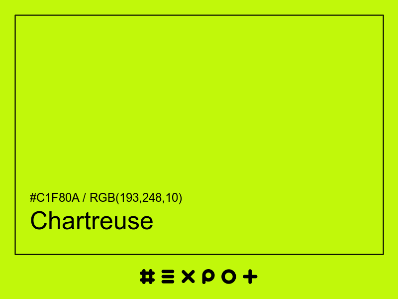
Chartreuse is vivid, warm-toned shade of mid yellow. It is better contrasting with black. This color combines beautifully with mid blue, red magenta or mid cyan

Inverse Color #3e07f5
Complementary Color #4109f8
Color Shade: mid yellow (73.87° hue)
Color Temperature: warm
Lightness: 50.59% (better contrasting with black)
Chartreuse Color Sample

Better Alternatives To #c1f80a

If you're looking for a similar mid yellow shade, there are some better alternatives to Chartreuse Color. The Electric Leaf color for instance is a darker and a bit more vibrant option, however this color has a warm yellow bias. Consider a darker and more saturated alternative called Overgrown (#88dd00) for more energetic effect. Try Sheen Green as it also a bit more vibrant and energetic.

Complementary Palette

#4109f8 is the best complementary color to Chartreuse. Mid blue shades generally complement the mid yellow hues best as they are found on the opposite end of the color wheel. The most popular #c1f80a complementary color is Blue, as it offers maximum contrast and grab the viewer's attention.

Analogous Palette

The analogous palette of orange, mid yellow, and yellow green colors offers a soft combination of similar warm shades. The analogous colors of Lime are #f8b809 and #49f809. Thus found on the left and right of #c1f80a on the color wheel with a 30° gap. Consider matching Sun and Harlequin colors as they work well with Chartreuse.

Split-complementary Palette

The split-complementary Chartreuse palette consists of #b809f8 and #0949f8 colors. They can be found 30° apart on either side of the complementary color (#4109f8). Try Electric Violet and Blue Ribbon colors in combination with #c1f80a, as they are not as contrasting as a complementary color, hence, giving more hue variety to make your design stand out.

Triadic Palette

The triadic palette of #c1f80a offers a combination of mid magenta and mid cyan shades and equally high contrast between the three of them. Find triadic colors at the 120° distance from the Chartreuse. Thus Shocking Pink and Bright Turquoise giving maximum hue separation to use all three together.

Square Palette

The square color palette of Chartreuse contains three additional colors. Thus, complementary Blue, Bright Turquoise, and Red Ribbon split by 90° on the color wheel. #c1f80a square combo is a palette of mid yellow, green cyan, mid blue and red magenta shades that work together well.

Tetradic Palette

The tetradic palette is a bit more complex than the square and has more of a rectangle shape. Chartreuse tetradic combo consists of mid blue complementary color (#4109f8) and two others. The Bright Turquoise is positioned 120° clockwise from the primary color and Vermilion – 120° from the complementary Blue. This palette is not recommended to use as-is. Try to tweak the saturation and brightness of #09c1f8 and #f84009.

Conversion Table

In a RGB color space, hex #c1f80a is made of 43% red, 55% green and 2% blue. In a HSL mode Chartreuse has a hue angle of 73.87°, a saturation of 94.44% and a lightness of 50.59%. In a CMYK space (used in printing only), hex #c1f80a is made of 21.56% cyan, 0% magenta, 93.33% yellow and 2.75% black ink.

HEX #c1f80a
RGB Decimal rgb(193,248,10)
RGB Percentage 43%, 55%, 2%
CMYK 21.56, 0, 93.33, 2.75
HSL hsl(73.87,94.44%,50.59%)
HSV (or HSB) hsv(73.87,95.97%,97.25%)
CIE-LAB lab(91.0049,-43.0257,87.2704)
XYZ xyz(55.6145,78.4942,12.5069)
;