Strawberry Pop Color

#ee2255

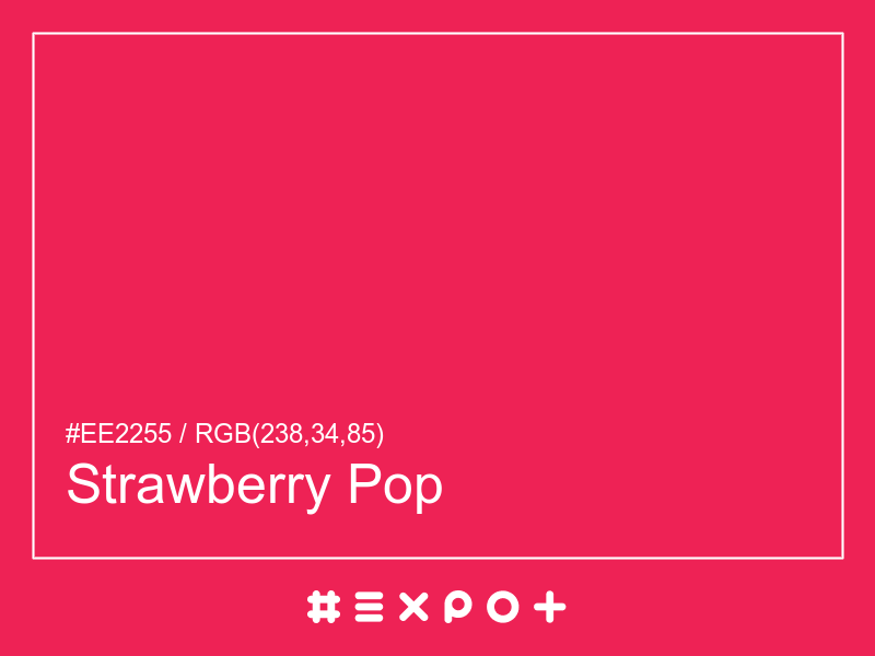
Strawberry Pop is vivid, warm-toned shade of red magenta. It is better contrasting with white. This color combines beautifully with warm cyan, warm blue or warm green

Inverse Color #1da
Complementary Color #22edbb
Color Shade: red magenta (345° hue)
Color Temperature: warm
Lightness: 53.33% (better contrasting with white)
Strawberry Pop Color Sample

Better Alternatives To #ee2255

If you're looking for a similar red magenta shade, there are some better alternatives to Strawberry Pop Color. The Watermelon Sugar color for instance is a darker and a bit more faded option, however this color has a warm magenta bias. Consider a darker and more soft alternative called Lollipop (#cc1c3b) for more calm effect. Try California Sunset as it also a bit more faded and calm.

Complementary Palette

#22edbb is the best complementary color to Strawberry Pop. Warm cyan shades generally complement the red magenta hues best as they are found on the opposite end of the color wheel. The most popular #e25 complementary color is Bright Turquoise, as it offers maximum contrast and grab the viewer's attention.

Analogous Palette

The analogous palette of warm magenta, red magenta, and warm red colors offers a soft combination of similar warm shades. The analogous colors of White are #ed22ba and #ed5522. Thus found on the left and right of #e25 on the color wheel with a 30° gap. Consider matching Shocking Pink and Flamingo colors as they work well with Strawberry Pop.

Split-complementary Palette

The split-complementary Strawberry Pop palette consists of #22bbed and #22ed55 colors. They can be found 30° apart on either side of the complementary color (#22edbb). Try Picton Blue and Malachite colors in combination with #e25, as they are not as contrasting as a complementary color, hence, giving more hue variety to make your design stand out.

Triadic Palette

The triadic palette of #e25 offers a combination of cool blue and warm green shades and equally high contrast between the three of them. Find triadic colors at the 120° distance from the Strawberry Pop. Thus Royal Blue and Bright Green giving maximum hue separation to use all three together.

Square Palette

The square color palette of Strawberry Pop contains three additional colors. Thus, complementary Bright Turquoise, Inch Worm, and Electric Violet split by 90° on the color wheel. #e25 square combo is a palette of red magenta, mid yellow, warm cyan and warm blue shades that work together well.

Tetradic Palette

The tetradic palette is a bit more complex than the square and has more of a rectangle shape. Strawberry Pop tetradic combo consists of warm cyan complementary color (#22edbb) and two others. The Bright Green is positioned 120° clockwise from the primary color and Electric Violet – 120° from the complementary Bright Turquoise. This palette is not recommended to use as-is. Try to tweak the saturation and brightness of #54ed22 and #bb22ed.

Conversion Table

In a RGB color space, hex #ee2255 is made of 67% red, 10% green and 24% blue. In a HSL mode Strawberry Pop has a hue angle of 345°, a saturation of 85.71% and a lightness of 53.33%. In a CMYK space (used in printing only), hex #ee2255 is made of 0% cyan, 80% magenta, 60% yellow and 6.67% black ink.

HEX #ee2255
RGB Decimal rgb(238,34,85)
RGB Percentage 67%, 10%, 24%
CMYK 0, 80, 60, 6.67
HSL hsl(345,85.71%,53.33%)
HSV (or HSB) hsv(345,85.71%,93.33%)
CIE-LAB lab(51.8113,74.3372,25.2731)
XYZ xyz(37.4716,19.9771,10.4753)
;