Happy Daze Color

#f7cf1b

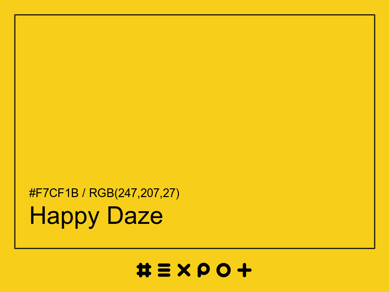
Happy Daze is soft, warm-toned shade of warm yellow. It is better contrasting with black. This color combines beautifully with cool blue, warm magenta or warm cyan

Inverse Color #0830e4
Complementary Color #1a42f7
Color Shade: warm yellow (49.09° hue)
Color Temperature: warm
Lightness: 53.73% (better contrasting with black)
Happy Daze Color Sample

Better Alternatives To #f7cf1b

If you're looking for a similar warm yellow shade, there are some better alternatives to Happy Daze Color. The Fire Yellow color for instance is a darker and a bit more vibrant option, however this color has a orange bias. Consider a darker and more saturated alternative called Orange Creamsicle (#ffb710) for more energetic effect. Try Zheleznogorsk Yellow as it also a bit more vibrant and energetic.

Complementary Palette

#1a42f7 is the best complementary color to Happy Daze. Cool blue shades generally complement the warm yellow hues best as they are found on the opposite end of the color wheel. The most popular #f7cf1b complementary color is Blue Ribbon, as it offers maximum contrast and grab the viewer's attention.

Analogous Palette

The analogous palette of warm red, warm yellow, and cool yellow colors offers a soft combination of similar warm shades. The analogous colors of Ripe Lemon are #f7611a and #b1f71a. Thus found on the left and right of #f7cf1b on the color wheel with a 30° gap. Consider matching Ecstasy and Green Yellow colors as they work well with Happy Daze.

Split-complementary Palette

The split-complementary Happy Daze palette consists of #611af7 and #1ab1f7 colors. They can be found 30° apart on either side of the complementary color (#1a42f7). Try Electric Violet and Dodger Blue colors in combination with #f7cf1b, as they are not as contrasting as a complementary color, hence, giving more hue variety to make your design stand out.

Triadic Palette

The triadic palette of #f7cf1b offers a combination of cool magenta and warm cyan shades and equally high contrast between the three of them. Find triadic colors at the 120° distance from the Happy Daze. Thus Electric Violet and Bright Turquoise giving maximum hue separation to use all three together.

Square Palette

The square color palette of Happy Daze contains three additional colors. Thus, complementary Blue Ribbon, Malachite, and Shocking Pink split by 90° on the color wheel. #f7cf1b square combo is a palette of warm yellow, cool green, cool blue and warm magenta shades that work together well.

Tetradic Palette

The tetradic palette is a bit more complex than the square and has more of a rectangle shape. Happy Daze tetradic combo consists of cool blue complementary color (#1a42f7) and two others. The Bright Turquoise is positioned 120° clockwise from the primary color and Torch Red – 120° from the complementary Blue Ribbon. This palette is not recommended to use as-is. Try to tweak the saturation and brightness of #1af7cf and #f71a42.

Conversion Table

In a RGB color space, hex #f7cf1b is made of 51% red, 43% green and 6% blue. In a HSL mode Happy Daze has a hue angle of 49.09°, a saturation of 93.22% and a lightness of 53.73%. In a CMYK space (used in printing only), hex #f7cf1b is made of 0% cyan, 15.68% magenta, 86.27% yellow and 3.14% black ink.

HEX #f7cf1b
RGB Decimal rgb(247,207,27)
RGB Percentage 51%, 43%, 6%
CMYK 0, 15.68, 86.27, 3.14
HSL hsl(49.09,93.22%,53.73%)
HSV (or HSB) hsv(49.09,89.07%,96.86%)
CIE-LAB lab(84.2145,-0.9816,81.7302)
XYZ xyz(60.8684,64.4789,10.2745)
;