Midori Color

#2a603b

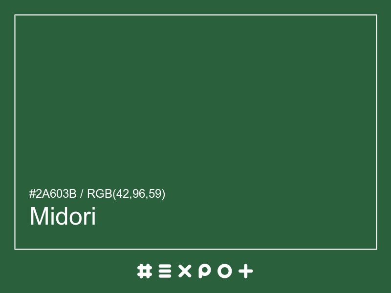
Midori is calm, warm-toned shade of cool green. It is better contrasting with white. This color combines beautifully with warm magenta, warm yellow or warm blue

Inverse Color #d59fc4
Complementary Color #5f2a4e
Color Shade: cool green (138.89° hue)
Color Temperature: warm
Lightness: 27.06% (better contrasting with white)
Midori Color Sample
Midori Color Sample

Better Alternatives To #2a603b

If you're looking for a similar cool green shade, there are some better alternatives to Midori Color. The Green Stain color for instance is a darker and a bit more faded option, however this color has a mid green bias. Consider a darker and more saturated alternative called Cal Poly Pomona Green (#1e4d2b) for more energetic effect. Try Rokushō Green as it also a bit more faded and calm.

Complementary Palette

#5f2a4e is the best complementary color to Midori. Warm magenta shades generally complement the cool green hues best as they are found on the opposite end of the color wheel. The most popular #2a603b complementary color is Finn, as it offers maximum contrast and grab the viewer's attention.

Analogous Palette

The analogous palette of warm green, cool green, and warm cyan colors offers a soft combination of similar warm shades. The analogous colors of Killarney are #345f2a and #2a5f55. Thus found on the left and right of #2a603b on the color wheel with a 30° gap. Consider matching Woodland and Spectra colors as they work well with Midori.

Split-complementary Palette

The split-complementary Midori palette consists of #5f2a33 and #562a5f colors. They can be found 30° apart on either side of the complementary color (#5f2a4e). Try Buccaneer and Bossanova colors in combination with #2a603b, as they are not as contrasting as a complementary color, hence, giving more hue variety to make your design stand out.

Triadic Palette

The triadic palette of #2a603b offers a combination of warm red and warm blue shades and equally high contrast between the three of them. Find triadic colors at the 120° distance from the Midori. Thus Quincy and Jacarta giving maximum hue separation to use all three together.

Square Palette

The square color palette of Midori contains three additional colors. Thus, complementary Finn, Rhino, and Costa Del Sol split by 90° on the color wheel. #2a603b square combo is a palette of cool green, cool blue, warm magenta and warm yellow shades that work together well.

Tetradic Palette

The tetradic palette is a bit more complex than the square and has more of a rectangle shape. Midori tetradic combo consists of warm magenta complementary color (#5f2a4e) and two others. The Jacarta is positioned 120° clockwise from the primary color and Woodland – 120° from the complementary Finn. This palette is not recommended to use as-is. Try to tweak the saturation and brightness of #3b2a5f and #4e5f2a.

Conversion Table

In a RGB color space, hex #2a603b is made of 21% red, 49% green and 30% blue. In a HSL mode Midori has a hue angle of 138.89°, a saturation of 39.13% and a lightness of 27.06%. In a CMYK space (used in printing only), hex #2a603b is made of 21.18% cyan, 0% magenta, 14.51% yellow and 62.35% black ink.

HEX #2a603b
RGB Decimal rgb(42,96,59)
RGB Percentage 21%, 49%, 30%
CMYK 21.18, 0, 14.51, 62.35
HSL hsl(138.89,39.13%,27.06%)
HSV (or HSB) hsv(138.89,56.25%,37.65%)
CIE-LAB lab(36.3167,-27.2261,15.8418)
XYZ xyz(5.9271,9.1737,5.596)
;