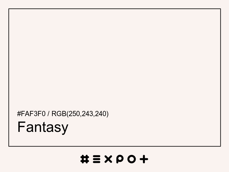
Fantasy is pale, warm-toned shade of warm red. It is better contrasting with black. This color combines beautifully with cool cyan, violet or cool green
| Inverse Color | #050c0f |
| Complementary Color | #eff7fa |
| Color Shade: | warm red (18° hue) |
| Color Temperature: | warm |
| Lightness: | 96.08% (better contrasting with black) |
If you're looking for a similar warm red shade, there are some better alternatives to Fantasy Color. The Pink Zest color for instance is a darker and a bit more vibrant option, however this color has a mid red bias. Consider a darker and more saturated alternative called Tan Whirl (#f1d7ce) for more energetic effect. Try Chinese Cherry as it also a bit more vibrant and energetic.
#eff7fa is the best complementary color to Fantasy. Cool cyan shades generally complement the warm red hues best as they are found on the opposite end of the color wheel. The most popular #faf3f0 complementary color is Black Squeeze, as it offers maximum contrast and grab the viewer's attention.
The analogous palette of cool red, warm red, and orange colors offers a soft combination of similar warm shades. The analogous colors of Fantasy are #faeff1 and #faf7ef. Thus found on the left and right of #faf3f0 on the color wheel with a 30° gap. Consider matching Fantasy and White Linen colors as they work well with Fantasy.
The split-complementary Fantasy palette consists of #eff2fa and #effaf7 colors. They can be found 30° apart on either side of the complementary color (#eff7fa). Try Link Water and Aqua Spring colors in combination with #faf3f0, as they are not as contrasting as a complementary color, hence, giving more hue variety to make your design stand out.
The triadic palette of #faf3f0 offers a combination of warm blue and cool green shades and equally high contrast between the three of them. Find triadic colors at the 120° distance from the Fantasy. Thus White Lilac and Narvik giving maximum hue separation to use all three together.
The square color palette of Fantasy contains three additional colors. Thus, complementary Black Squeeze, Peppermint, and White Lilac split by 90° on the color wheel. #faf3f0 square combo is a palette of warm red, yellow green, cool cyan and violet shades that work together well.
The tetradic palette is a bit more complex than the square and has more of a rectangle shape. Fantasy tetradic combo consists of cool cyan complementary color (#eff7fa) and two others. The Narvik is positioned 120° clockwise from the primary color and Amour – 120° from the complementary Black Squeeze. This palette is not recommended to use as-is. Try to tweak the saturation and brightness of #effaf2 and #faeff7.
In a RGB color space, hex #faf3f0 is made of 34% red, 33% green and 33% blue. In a HSL mode Fantasy has a hue angle of 18°, a saturation of 50% and a lightness of 96.08%. In a CMYK space (used in printing only), hex #faf3f0 is made of 0% cyan, 2.75% magenta, 3.92% yellow and 1.96% black ink.
| HEX | #faf3f0 |
| RGB Decimal | rgb(250,243,240) |
| RGB Percentage | 34%, 33%, 33% |
| CMYK | 0, 2.75, 3.92, 1.96 |
| HSL | hsl(18,50%,96.08%) |
| HSV (or HSB) | hsv(18,4%,98.04%) |
| CIE-LAB | lab(96.2932,1.8266,2.2627) |
| XYZ | xyz(87.2031,90.7164,95.352) |