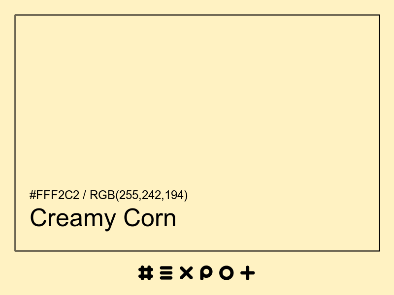
Creamy Corn Color

#fff2c2

Creamy Corn is pale, warm-toned shade of warm yellow. It is better contrasting with black. This color combines beautifully with cool blue, warm magenta or warm cyan

Inverse Color #000d3d
Complementary Color #c2cfff
Color Shade: warm yellow (47.21° hue)
Color Temperature: warm
Lightness: 88.04% (better contrasting with black)
Creamy Corn Color Sample

Better Alternatives To #fff2c2

If you're looking for a similar warm yellow shade, there are some better alternatives to Creamy Corn Color. The Sparkling Cider color for instance is a lighter and a bit more faded option, however this color has a orange bias. Consider a lighter and more soft alternative called Silky Tofu (#fff5e4) for more calm effect. Try Apricot White as it also a bit more faded and calm.

Complementary Palette

#c2cfff is the best complementary color to Creamy Corn. Cool blue shades generally complement the warm yellow hues best as they are found on the opposite end of the color wheel. The most popular #fff2c2 complementary color is Periwinkle, as it offers maximum contrast and grab the viewer's attention.

Analogous Palette

The analogous palette of warm red, warm yellow, and cool yellow colors offers a soft combination of similar warm shades. The analogous colors of Egg White are #ffd3c2 and #edffc2. Thus found on the left and right of #fff2c2 on the color wheel with a 30° gap. Consider matching Romantic and Chiffon colors as they work well with Creamy Corn.

Split-complementary Palette

The split-complementary Creamy Corn palette consists of #d3c2ff and #c2edff colors. They can be found 30° apart on either side of the complementary color (#c2cfff). Try Melrose and Onahau colors in combination with #fff2c2, as they are not as contrasting as a complementary color, hence, giving more hue variety to make your design stand out.

Triadic Palette

The triadic palette of #fff2c2 offers a combination of cool magenta and warm cyan shades and equally high contrast between the three of them. Find triadic colors at the 120° distance from the Creamy Corn. Thus Mauve and Aero Blue giving maximum hue separation to use all three together.

Square Palette

The square color palette of Creamy Corn contains three additional colors. Thus, complementary Periwinkle, Aero Blue, and Cotton Candy split by 90° on the color wheel. #fff2c2 square combo is a palette of warm yellow, cool green, cool blue and warm magenta shades that work together well.

Tetradic Palette

The tetradic palette is a bit more complex than the square and has more of a rectangle shape. Creamy Corn tetradic combo consists of cool blue complementary color (#c2cfff) and two others. The Aero Blue is positioned 120° clockwise from the primary color and Pink – 120° from the complementary Periwinkle. This palette is not recommended to use as-is. Try to tweak the saturation and brightness of #c2fff2 and #ffc2cf.

Conversion Table

In a RGB color space, hex #fff2c2 is made of 37% red, 35% green and 28% blue. In a HSL mode Creamy Corn has a hue angle of 47.21°, a saturation of 100% and a lightness of 88.04%. In a CMYK space (used in printing only), hex #fff2c2 is made of 0% cyan, 5.1% magenta, 23.92% yellow and 0% black ink.

HEX #fff2c2
RGB Decimal rgb(255,242,194)
RGB Percentage 37%, 35%, 28%
CMYK 0, 5.1, 23.92, 0
HSL hsl(47.21,100%,88.04%)
HSV (or HSB) hsv(47.21,23.92%,100%)
CIE-LAB lab(95.4379,-2.9407,24.7822)
XYZ xyz(82.7297,88.6593,63.7916)
;